What Makes a Business Dashboard Truly Valuable?
- adrianzinovei
- Jun 25, 2025
- 3 min read

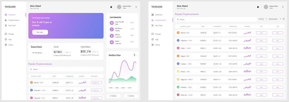
A business dashboard is more than just a collection of charts — it’s a strategic decision-making tool. In the right hands, a well-designed dashboard can transform raw data into actionable insights, helping leaders make better decisions faster. But in practice, many dashboards fall short because they are cluttered, confusing, or slow.
So, what separates a good dashboard from a truly valuable one? It comes down to four core principles: Clarity, Relevance, Interactivity, and Performance.
1. Clarity — Understandable in 5 Seconds
The Rule: If someone can’t understand your dashboard within 5 seconds, it’s too complicated.
Dashboards should present the most important metrics front and center, using clean visuals, clear labels, and consistent formatting. Avoid overloading the page with too many charts or colors — instead, guide the viewer’s eye with a clear visual hierarchy.
Tips for Clarity:
Use a logical layout (top = summary, middle = trends, bottom = details).
Limit the number of visual elements per page.
Keep legends, filters, and labels concise and consistent.
2. Relevance — Every Metric Should Drive a Decision
The Rule: If a metric doesn’t help someone take action, it doesn’t belong on the dashboard.
A truly valuable dashboard is laser-focused on the audience’s needs. An operations manager needs different metrics than a CFO. Tailoring your dashboard to the end-user’s role and decisions ensures every number has a purpose.
What decision does this metric support?
Is it aligned with business goals?
Would removing it make the dashboard easier to understand?
3. Interactivity — Let Users Explore the Data
The Rule: A static dashboard is like a locked filing cabinet — it’s there, but you can’t get inside.
Interactivity transforms dashboards from reporting tools into exploration tools. By adding filters, parameters, and drill-downs, you empower users to answer their own questions without requesting a new report.
Ways to Add Interactivity in Tableau:
Filters: Let users view data by date range, product category, or location.
Parameters: Allow “what-if” scenario analysis.
Drill-downs: Enable clicking into a chart to see detailed data.
4. Performance — Speed Equals Adoption
The Rule: If your dashboard takes longer than a few seconds to load, adoption will suffer.
Busy professionals don’t have time to wait. A slow dashboard is frustrating, especially when viewed in meetings or on mobile devices. Tableau offers multiple optimization strategies to make dashboards lightning-fast.
Tips for Faster Dashboards:
Reduce the number of worksheets per dashboard.
Use extracts instead of live connections when possible.
Avoid overly complex calculations in the view — pre-calculate in the data source.
Pro Tip: Wireframe Before You Build
Before opening Tableau, sketch your dashboard layout on paper or use tools like Figma or PowerPoint. This step forces you to focus on content and flow, rather than jumping straight into colors and charts. Wireframing often prevents major redesigns later in the process.
Final Thoughts
A truly valuable business dashboard delivers clarity, relevance, interactivity, and performance — all wrapped in a design that speaks directly to the user’s needs. When you apply these principles, your dashboards stop being just “reports” and start becoming the strategic tools that shape better decisions and drive business growth.
If you’re building in Tableau, remember: start with a wireframe, focus on the end-user, and test on multiple devices before publishing. The result will be a dashboard that your audience actually uses — and trusts.


Comments